How to Provide Users With a Smooth Online Booking Experience (From a UX Writer’s Perspective)
Streamlining the online booking experience for service-based businesses is a challenging task. You need to distil complex logistics into simple interfaces to guide users each step of the way. To give a smooth online booking experience, you need to balance clarity and customization on the website.
From the lens of a UX writer, you can deduce valuable insights from their approach to onboarding, payment gateway integration, copywriting, and intuitive design. This in-depth article will show how to apply UX settings and strategies to design a seamless online booking website.
Creating a Welcoming Onboarding Flow
No one enjoys battling confusing interfaces. This is especially true when dealing with financially sensitive bookings. A neat signup hooks users from the start.
Minimal Steps With a Purposeful Copy
The onboarding flow should be simple, i.e., name, email, password, role, industry, and start booking. The content length should be like Gravity Booking for a smooth online booking experience. Moreover, descriptive microcopy clarifies each field concisely.
For example, “Industry best describes your business” and “Password requirements” labels leave no question about what information is needed.
Visually Scannable Layout

Clean left-aligned text in narrow columns makes each step easy to digest. Progress bar + step numbers guide users through a checkout-like funnel visually. Also, blank space balances copy-heavy sections. Focused content keeps users moving forward for a scannable online booking experience.
Clear CTA Buttons
Primary CTAs feature contrasting colors and strong action verbs like “Create your account.” The bold green draws the eye. Supporting links use muted blue to reduce distraction. Overall, the visual hierarchy should be well-implemented.
Similarly, frictionless onboarding reassures users their booking needs are understood.
Crafting an Intuitive Booking Widget

Embedding booking directly on service provider websites improves conversions over off-site systems. Gravity Booking’s widget is an excellent example of this.
Making Widget Customization Easy
Preset layouts, color palettes, and text options enable tailoring the widget’s look. The settings panel should label each section clearly. Dropdowns explain style choices like “Rounded corners” and “Full-width button” works better. Although UX writers know tech terms, the explanation options should be easy to read for a smooth online appointment booking website.
Linking to Booking Funnel
The prominent “Book Now” button is essential for a configurable booking funnel that collects booking details. This way, providers can capture user info without cluttering the initial widget. Each step in the booking funnel should feature a clear microcopy and purpose. A progress bar is also desirable for tracking completion.
Presenting Availability Clearly
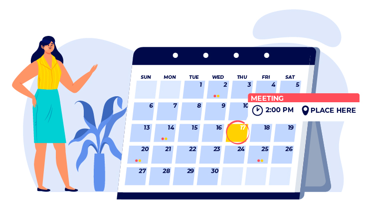
A calendar displays availability prominently. View toggles between days/weeks/months adapt to user needs. Open slots are marked clearly. Upon selecting a date, available times populate below. The relationship between the calendar and time slots creates a logical booking sequence.
Through thoughtful configuration options and intuitive linking between views, Gravity Booking’s booking widget removes friction from signing up and accepting bookings.
Optimizing the Management Dashboard

For service providers, the Gravity Booking management dashboard is mission control for bookings. How does the UI/UX design perform there?
Reviewing At-a-Glance Analytics
Stats like the number of appointments, sales, and new bookings this week/month give quick performance insights. Summary metrics focus users on key data. The tabbed organization lets users dig into report details. But high-level numbers greet users first, following best practice dashboard design.
Calendars That Highlight Important Appointments
The full calendar shows upcoming bookings color-coded by status. Icons should visually distinguish appointment types like video calls. Options to edit, cancel, and email customers should be conveniently accessible.

Customer Profiles and Interaction Tools
Compact customer profiles present essential information like appointment history, purchased packages, and billing. Message and email customers directly from their profiles. Data and actions related to customers are clustered to ease management.
Configuration Through Intuitive Settings Pages
Grouped settings use clear text labels like “Booking Page Setup” and “Customer Management.” Descriptions explain configurations. Visual components in a booking form like toggles, dropdowns, and bulk action checkboxes simplify actions while maintaining customization power.
For service providers, Gravity Booking enhances clarity by reducing clutter. The UI surfaces only the most pertinent information and actions for each context – a perfect depiction of a smooth online booking experience.
Key Takeaways as UX Writers
Gravity Booking’s thoughtful UX offers these lessons for anyone designing online booking flows:
- Guide users proactively with microcopy
Labels, hints, and tooltips prevent confusion and answer questions.
- Balance clarity with customizable options
Empower personalization without overwhelming through settings panels and presets.
- Focus each page on one primary user goal
Remove clutter by structuring pages and copying around specific tasks and intents.
- Use visual styling to create a hierarchy
Draw attention to key elements and relationships through layout, color, and typography.
- Enable easy access to help resources
Documentation, tooltips, and live chat rescue users if they get disoriented.
Creating a customized online booking experience that caters to both service providers and their customers is challenging. But services like Gravity Booking show how employing UX writing best practices helps bridge that gap. We can apply these same principles of clarity, focused content, visual organization, and proactive assistance in our own booking products. Good UX often boils down to showing users you understand their needs through considered content at every touchpoint.
Turning Lessons Learned into Booking Plugin Improvements
After analyzing Gravity Booking, we can make some optimizations to improve UX for booking plugins:
Onboarding
- Add descriptive captions for all form fields so users know what to enter. Avoid generic labels like “Description”.
- Chunk booking setup across multiple pages to avoid lengthy scrolling forms. Use a progress tracker.
- Offer pre-made templates and previews for widget styling to make customization easier.
Booking Widget
- When dates are clicked, show available appointment times immediately below the calendar, group date, and time selection.
- Indicate service duration and pricing upfront when booking. Make the total cost clear.
- Add animations and transitions when switching calendar views to help users orient themselves.
Management Dashboard
- Summarize top metrics like appointment counts and revenue in a statistics bar up top. Details sit below.
- Allow sorting and filtering appointments listed to help manage high volume.
- Add one-click reminders when viewing appointments to prompt customer follow-up.
By learning from well-designed booking websites like Gravity Booking, you can level up user experiences in your services. Thoughtful text combined with intuitive interfaces paves the way for online booking success.
Wrap Up
This examination shows how you, as a UX writer, have many opportunities to guide and inform users through each booking workflow. I hope you feel inspired to create simple and innovative online booking experiences using the principles we covered. Feel free to reach out if you have any other UX-related questions.